To: ESPN broadcasters and producers:
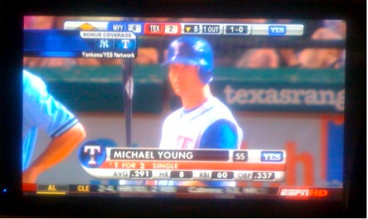
So I’m watching bonus coverage of the Yankees-Rangers game. There’s all this annoying stuff on the screen as Michael Young comes to the plate with two men on and Rangers trailing by two runs. In an instant, Young crushes a Joba Chamberlain fastball for a three-run homer. The Rangers take the lead and win. I miss the full thrill of it in because the moment is lost in the junk that precedes and follows it. Instant replay provides an artificial moment lacking authenticity and the immediacy of human drama. Despite more information on my screen, I feel cheated.
You know what I’m talking about: those cheesy, annoying graphics that continually fly into the screen, scroll across the bottom, obscure the image, and intrude on unfolding strategy and drama.
Sports Center is great, as always. Baseball Tonight is good, too, even with its insufferable over-analysis. But is anyone in Bristol actually thinking about the experience of baseball on the games that ESPN broadcasts?
Though I yearn for Ernie Harwell or Vin Scully, I’m learning to deal with the noise from jock announcers who detract from the flow of the game with incessant nonsense that fills the space between action on the field. Baseball is played as much between the ears as it is between the lines. There’s poetry in the leisurely pace, the mano-a-mano confrontations, and the bursts of sustained drama. There is magic in its silences and signs. I wish announcers would take a breath, sit on their microphones and trust the emotional connection that an informed audience has with the game. But I’ll settle for taking out the visual trash.
The proliferation of mindless graphics, animated commercials, and garish decorations masquerading as useful information have ruined the experience of watching baseball on television. Large screens and HDTV make the problem bigger than the game. Such is the scale of the litter.
Broadcasters should understand that everything on the screen is content: the background, the noise, the movement, the plays, the environment, the ballpark advertisements, the strategy, and the thinking. Why ruin it by pasting layers of data over it? It’s like putting sticky notes on a Picasso.
Higher resolution and larger screens enable a more robust display of the quantitative data that surrounds the game. That’s a good thing. The problem is design: the data ought to be displayed on the margins without decoration, outside the viewing perimeter of the action on the field. And the data ought be optional, liked closed captioning, for those who prefer to enhance their experience with fewer or more statistics and scores, even advertisements.
With a nod to better design, here’s a quick and easy alternative that celebrates the game instead of stepping on it: