The first impressions of the new James B. Hunt Library at North Carolina State University leave you speechless. But unlike most libraries, talk here is encouraged. The first words are typically “where are the books?”
The vast majority, about 1.5 million volumes, are in the basement, packed in industrial storage bins stacked four-stories high. Find the volume you need at computer station then watch behind a glass wall as Transformer-like robots called bookbots roam the floor, locate the appropriate bin, and expand into rotating arms and hands that remove the bin. The bookbot delivers the bin to one of the few humans working in the place. The humanoid removes the book, then scans a code from the first page. Check-out complete. It takes about four minutes.
And that’s the ordinary part of the library. The real brilliance is what happens on the other four floors.
Each brings an architecture for the way we learn. You can lose yourself in a Womb Chair for private, contemplative study. Or you can collaborate with a friend, study group or team around a white-board table, study pod, private office or Fishbowl — think tech/startup culture.
Since most people – all students? – consume and create information on video screens, screens of all shapes and function spread information, hundreds of millions of pixels, through The Hunt. But don’t expect the TV control-room look. High-definition screens are designed for distinct spaces, integrated with the intended learning experience. Some screens are built into walls. Some are embedded in table surfaces. Some are part of the architecture. Or part of the furniture. Nearly all respond to touch.
Technology enhances spaces for large-scale visualization research, videoconferencing and multimedia production. One room is dedicated to high-end gaming, not just for entertainment but for a host of serious applications. There’s a reconfigurable Creativity Studio with sliding and rotating walls. Remember the Holodeck on Star Trek? The Teaching and Visualization Lab allows students and teachers to create a virtual, immersive environment such as the bridge of an aircraft carrier – or the Starship Enterprise.
The Hunt goes where no library has gone before. As I said earlier, talking is encouraged. So is writing on walls. There are nearly 100 rooms that students can reserve to work together on projects, with screens to display work from their laptops and the room-sized whiteboards formerly known as walls.
Photos? Snap away. The Hunt encourages visitors to take an awesome photo, upload it to Instagram and tag it #Hunt.Library. Photos are display and shared on a wall-sized video screen and at go.ncsu.edu/myhunt
Collaboration is key to the curriculum at NC State’s Centernnial Campus, a research campus developed in partnership with tech companies at the nearby Research Triangle Park just outside Raleigh. Students are taught to work collaboratively, and are accustomed to it, but they’ve had few suitable places until now. The library is so thoroughly digital that all functions run off a supercomputer, allowing students and faculty to work on projects wherever they are: the library, their offices, dorm rooms or labs.
Did I mention the architecture? There’s nothing quite like it in the U.S. The Hunt was designed by Snohetta, the cutting-edge Oslo firm that also designed the new library at Alexandria, Egypt.
“For the first time in my career, I just fielded a call from Architectural Digest,” David Hiscoe, director of communications for NCSU libraries told the News & Observer newspaper.
Interestingly, I couldn’t find any magazines or newspapers in print. No news boxes, magazine stands or analog Periodical section.
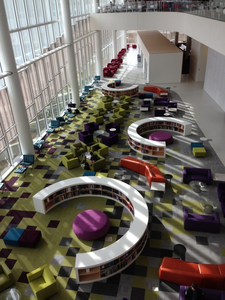
For all its so-now design, The Hunt still nods subtly to libraries past. A glass wall more than 300 feet long and 50 feet high creates a light-filled hall for reading with views of Lake Raleigh and the woods bordering the campus. Trees and water are essential ingredients of paper-making. The main hall – a place usually given to rows of card catalogs – honors the nostalgia for pulp with a metaphor: low, semi-circular shelves for books written by faculty. You can almost hear the voice of humanities dons at planning-committee meetings: We must see books somewhere! Fortunately, the sentimentality is restrained; the architects interpret the shelves as room dividers for communal space.
Without stacks, card catalogs or check-out stations a library lacks a defining, visual statement of action. The State of North Carolina has provided one at the entrance: the interactive Emerging Issues Commons.
“We believe the vision for the state and the answers to our most complex challenges will be found among the people of North Carolina. NO ONE PERSON HAS THE ANSWER. The Emerging Issues Commons will help our citizens work together to explore the issues that matter to them and collaborate to continually improve our state and its communities.”
It’s an expensive vision. The state, which is to say its citizens, spent $115 million to build the library and adjoining parking deck (no driverless Google cars were found, a disappointment). Citizen funders are encouraged to get into the act. At an interactive kiosk, North Carolinians can sign up to act on one of four issues: the economy, education, health and environments.
The Hunt experience is so encompassing, so collaborative that it’s apt to make gatekeepers everywhere a little uncomfortable. Like Google and Wikipedia, it doesn’t just add new technology to a very old idea, it creates a new idea that removes controls and moves toward consilience – unity of knowledge. So complete is this remaking that traditionalists and visionists alike wonder if The Hunt should even be called a library. Doesn’t matter. The Hunt transforms libraries into what they need to be.
A few photos from my iPhone. Go to the Instagram #Hunt.Librarypage for a sweep of the sweeping design.

