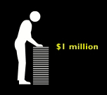
How big is the bad economy? It takes a Good graphic to see it.
 The always relevant Good magazine distributes a free poster on the economy at your neighborhood Starbucks beginning tomorrow. In an illustrated timeline titled “It’s the economy, stupid,” graphic designer Nigel Holmes outlines “how our temperamental economy machine works.” Or doesn’t.
Holmes’ patented, cartoon-like approach injects fun into serious stuff, managing to provide an easy-to-understand overview of the Big Mess. Over-simplistic and too cartoon-like for some tastes, Holmes nonetheless provides a visual antidote to an abundance of long, confusing stories about the structure underlying our complex economy – which crashed, it seems to me, because banks and brokers sold the same stuff over and over again in a get-rich pyramid scheme as the nation acquired more and more debt. Simple, huh?
The beauty of the graphic: a visual metaphor that enables you to put big numbers in scale and perspective. Poynter’s Sara Quinn interviews Holmes. Dowload a PDF file of the poster here.


