A fine mess, reconsidered
Our friend Craig Newmark and his left-brain friends designed craigslist with the aesthetic panache of a spread sheet. From that perspective it is a success that would make an accountant blush: 47 million page views monthly in the U.S. alone, and revenues of $100 million annually from a small percentage of the site’s content that is not free.
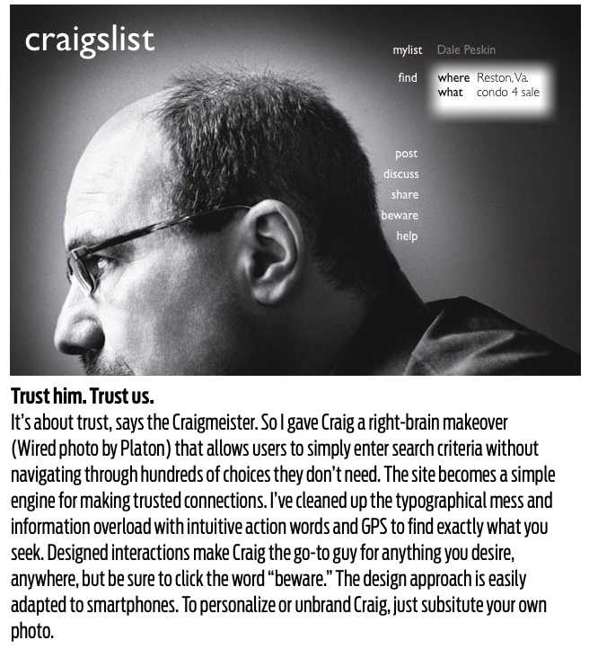
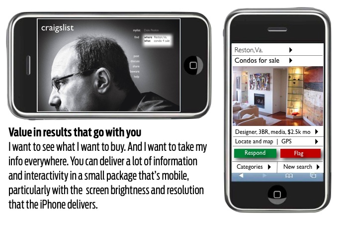
But even the most dedicated admirer can see that craigslist is a fine mess of informational spaghetti that can cause design indigestion. Wired magazine has prescribed an Extreme Makeover for craigslist and asked top designers as well as readers to give it a user-interface facelift.
Earlier this year, our friends at the Society for News Design created craigslist alternatives, formerly known as classifieds, for newspapers.
You can make the argument that ugly is aesthetic if it is successful and that the craigslist look-and-feel is part of its charm.
But I’d rather not look at plumbing. Here’s my attempt to make craigslist better to use and easier on the eyes. Design is a business model.


